
Moonbow Skincare
I began working with Moonbow, a Traditional Chinese Medicine-inspired skincare brand in its prelaunch & early launch phase. It was an exciting time to step in and help craft their brand identity, website, 3D rendering & product packaging, photography, and so much more.
Brand Identity
Creative Direction
Web Design
Packaging Design
3D Renderings
Email Design
Brand Photoshoot
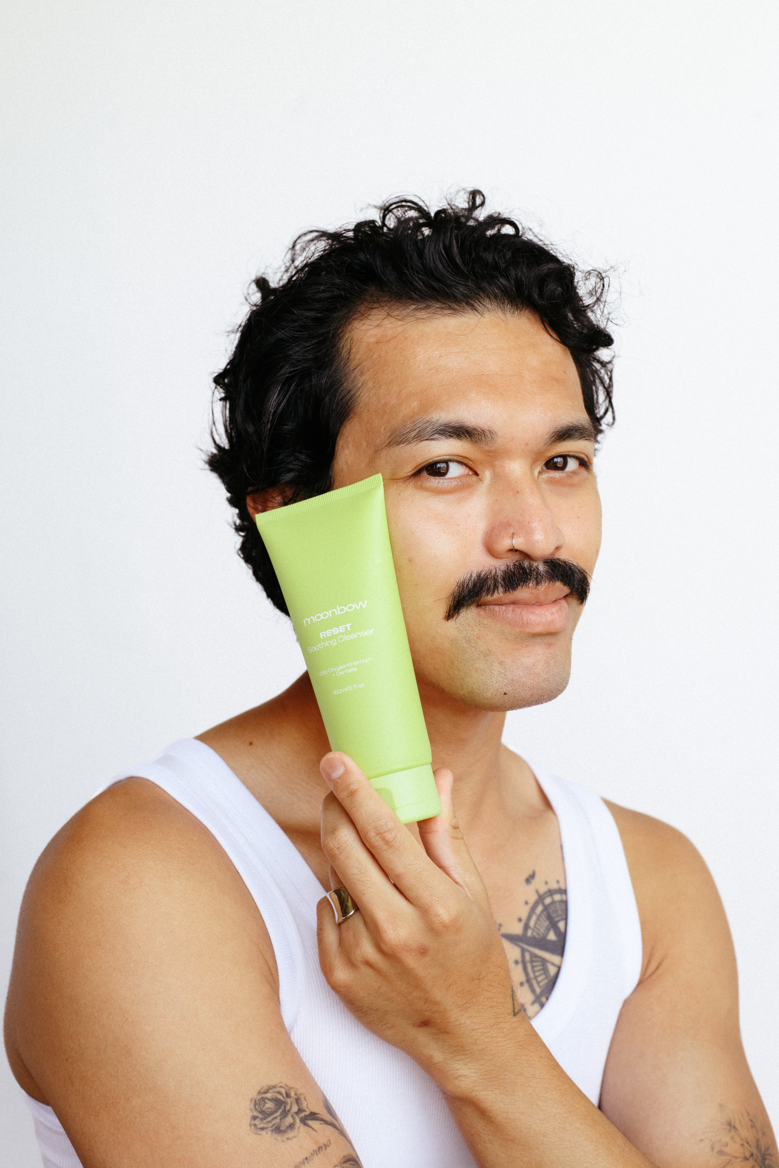
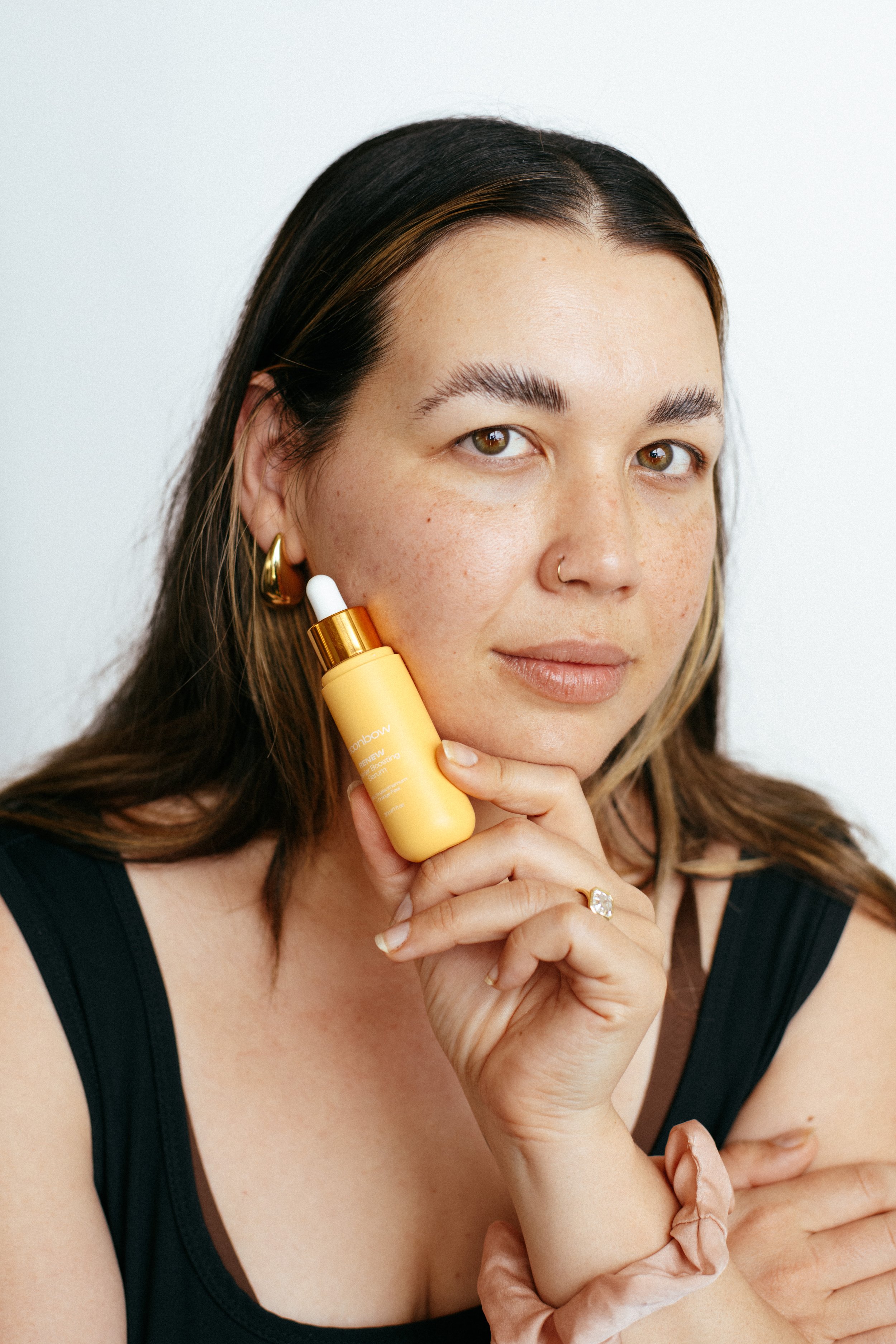
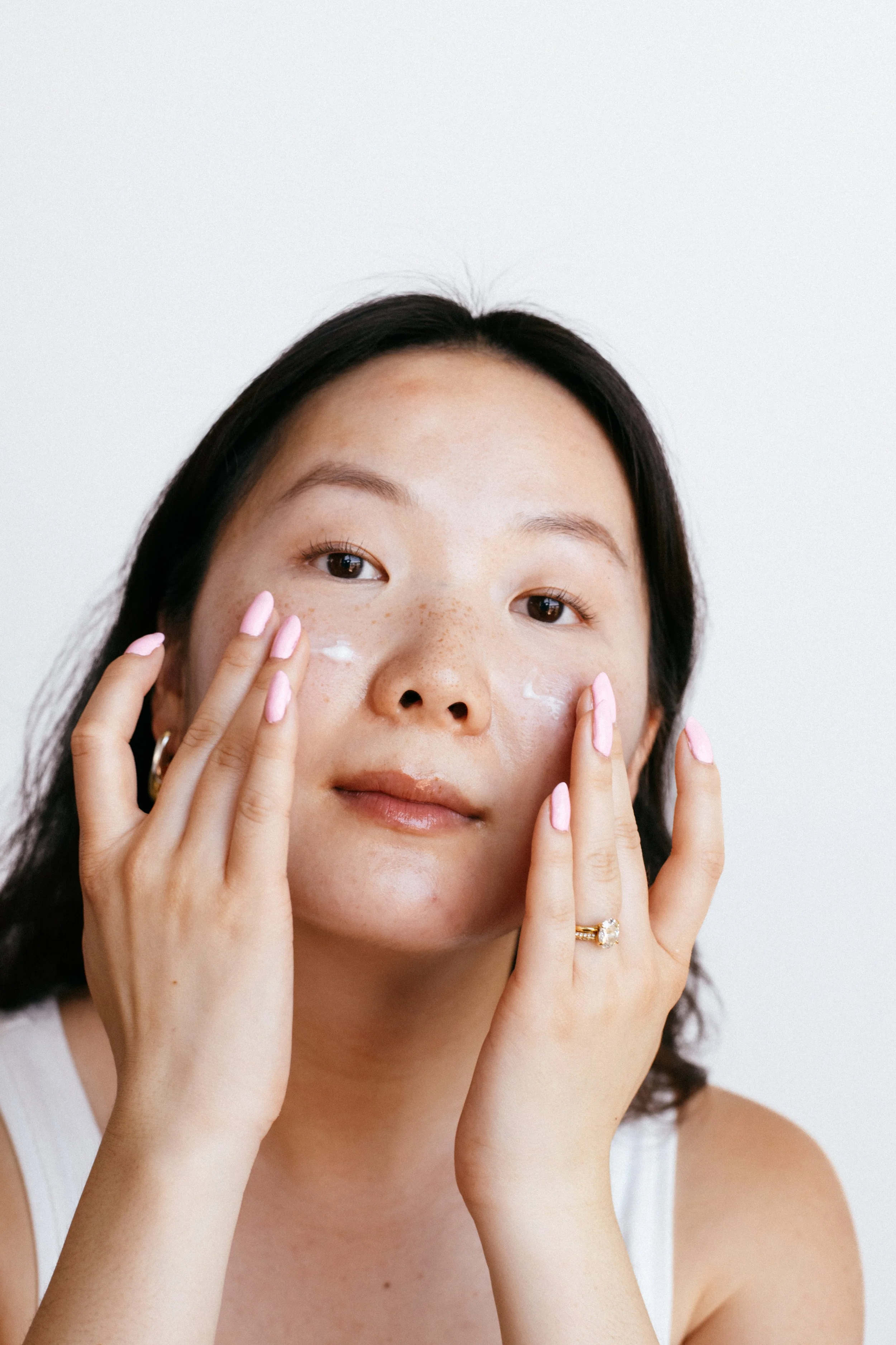
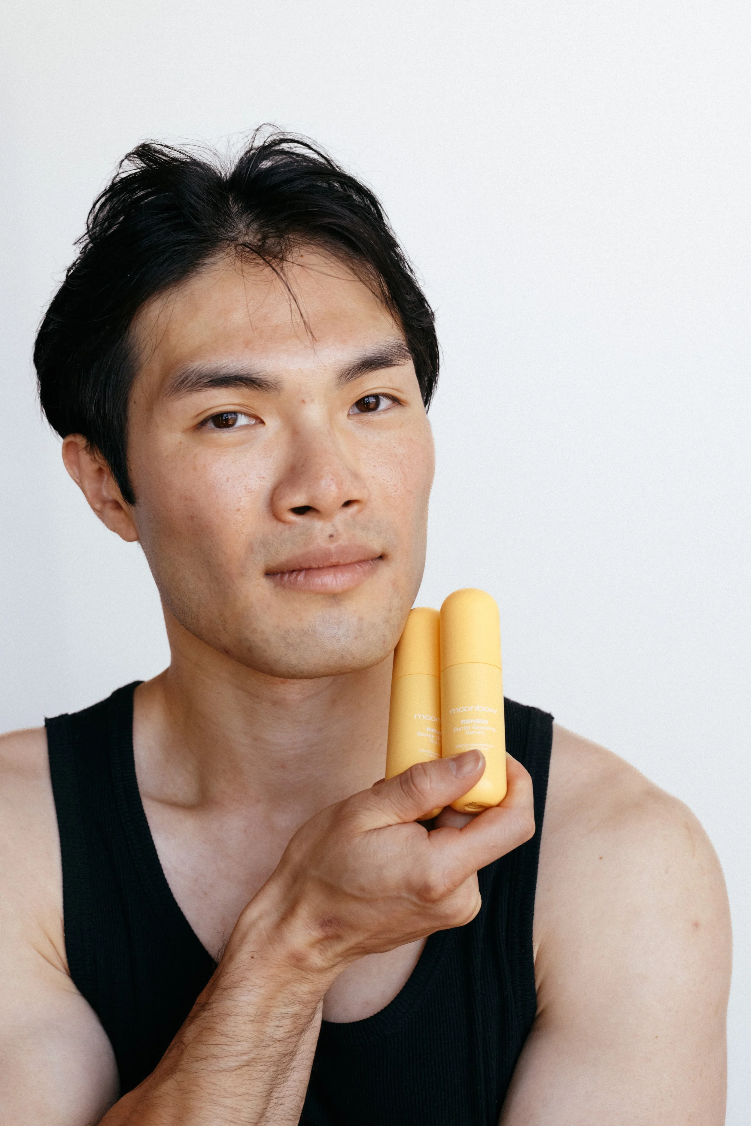
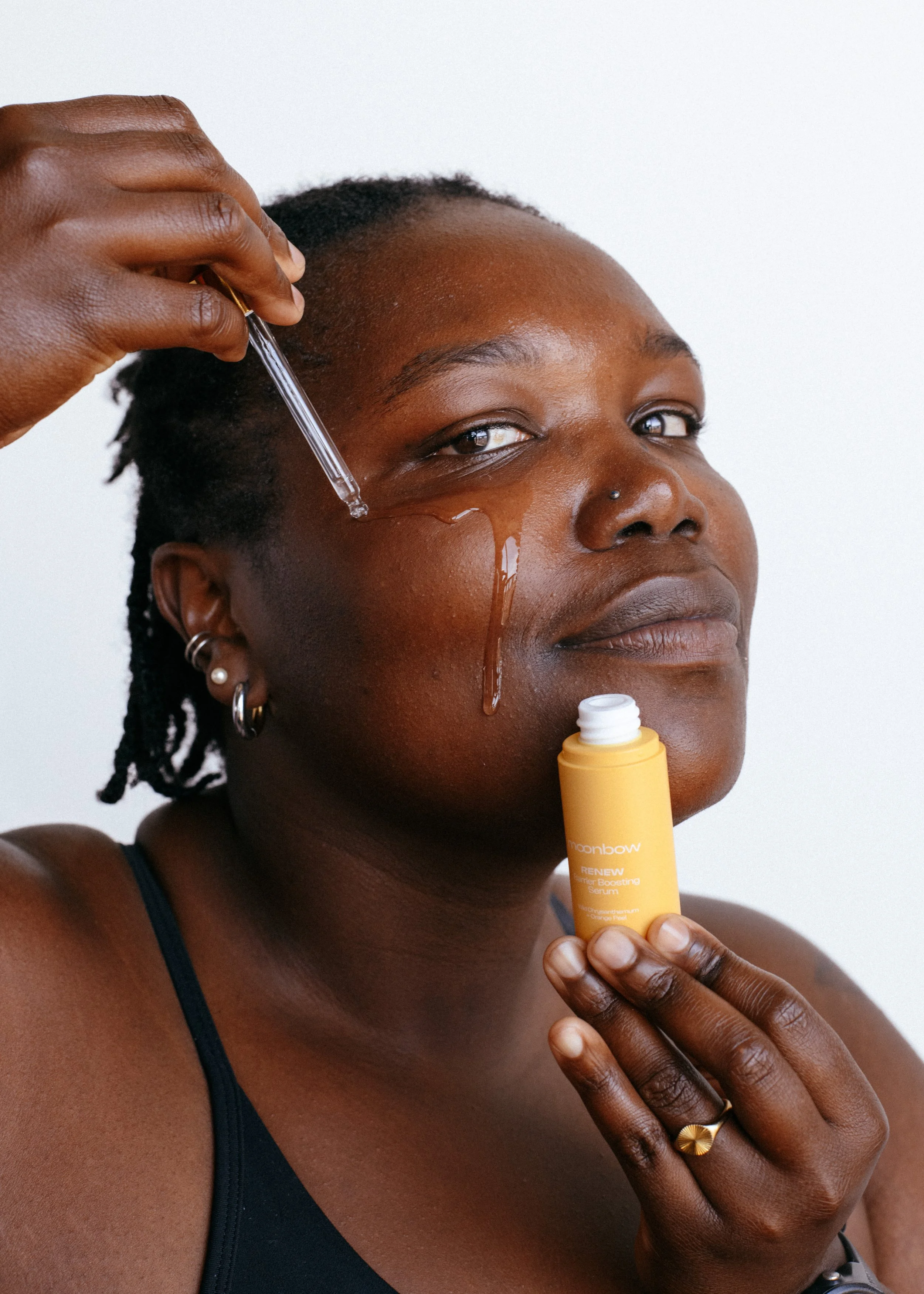
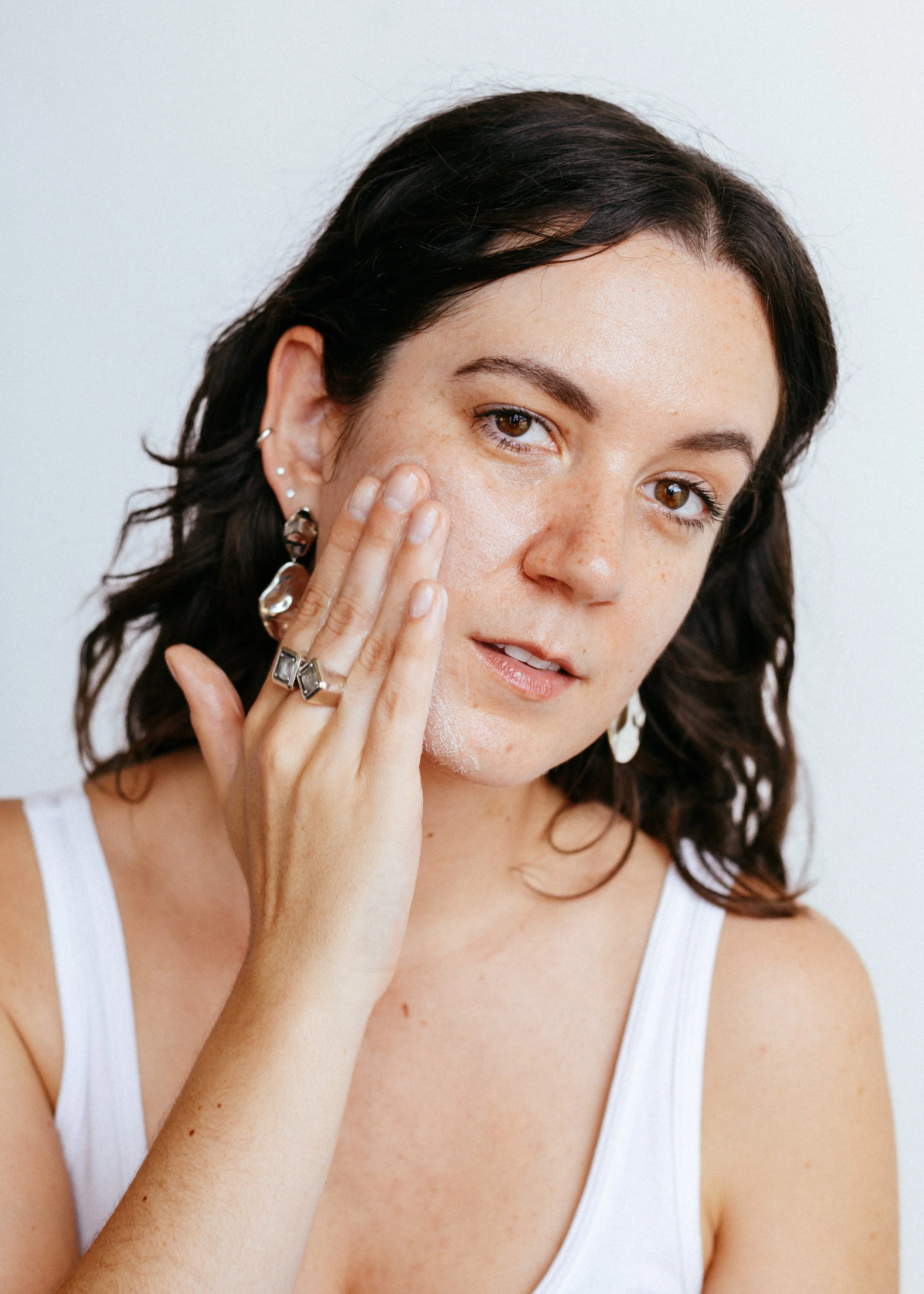
Evergreen photo assets - soft and glowy, with a focus on minimalism to make the products stand out.
Photos by Zoey Marchinak
Creative Director: me
Brand Identity
I found myself in an interesting position of coming up with the visual identity after crucial details like logo & packaging colors/design were set. Working backwards was a new challenge, but a rewarding experience to really think through how to tie the branding together.
BRAND COLORS
I knew the core packaging colors didn’t feel right for the brand (plus there were some issues with accessibility), and wanted to come up with a new anchor for the brand. We landed on three core colors: Nebula, Ancient Bark, and Pearl.
Ancient Bark grounds us in tradition, strength, and the healing power of nature.
Nebula illuminates transformation, the mystical beauty of the night, and infinite possibility.
Pearl is used as an alternative to white, tying the colors softly together.
Together, they reflect our balance between past and future, tangible and celestial, grounded and aspirational.

Web Design
Brand Campaign
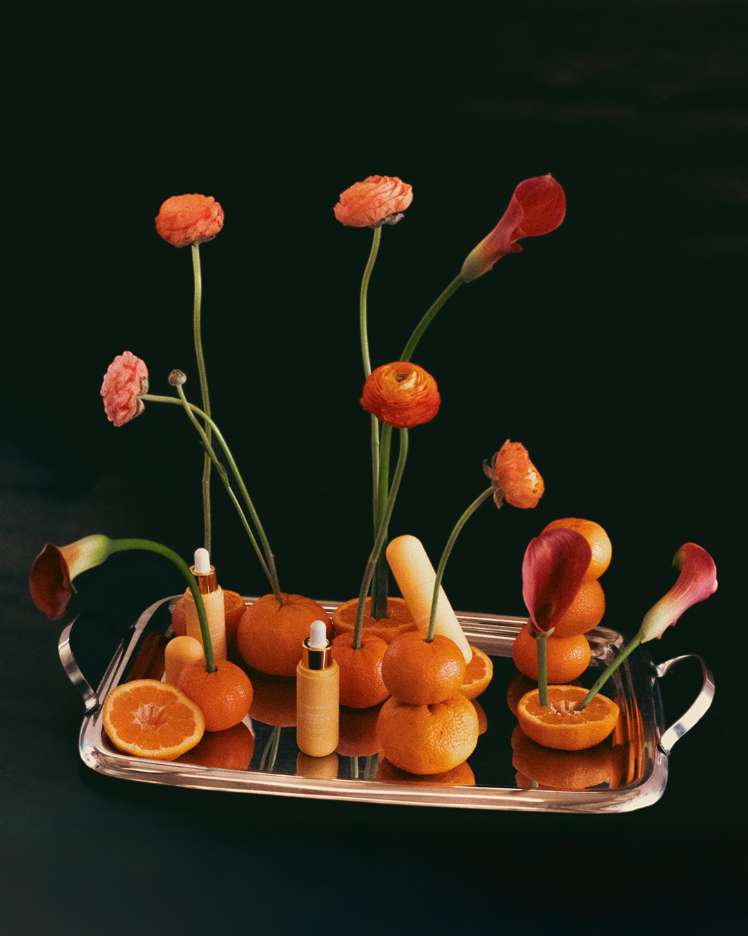

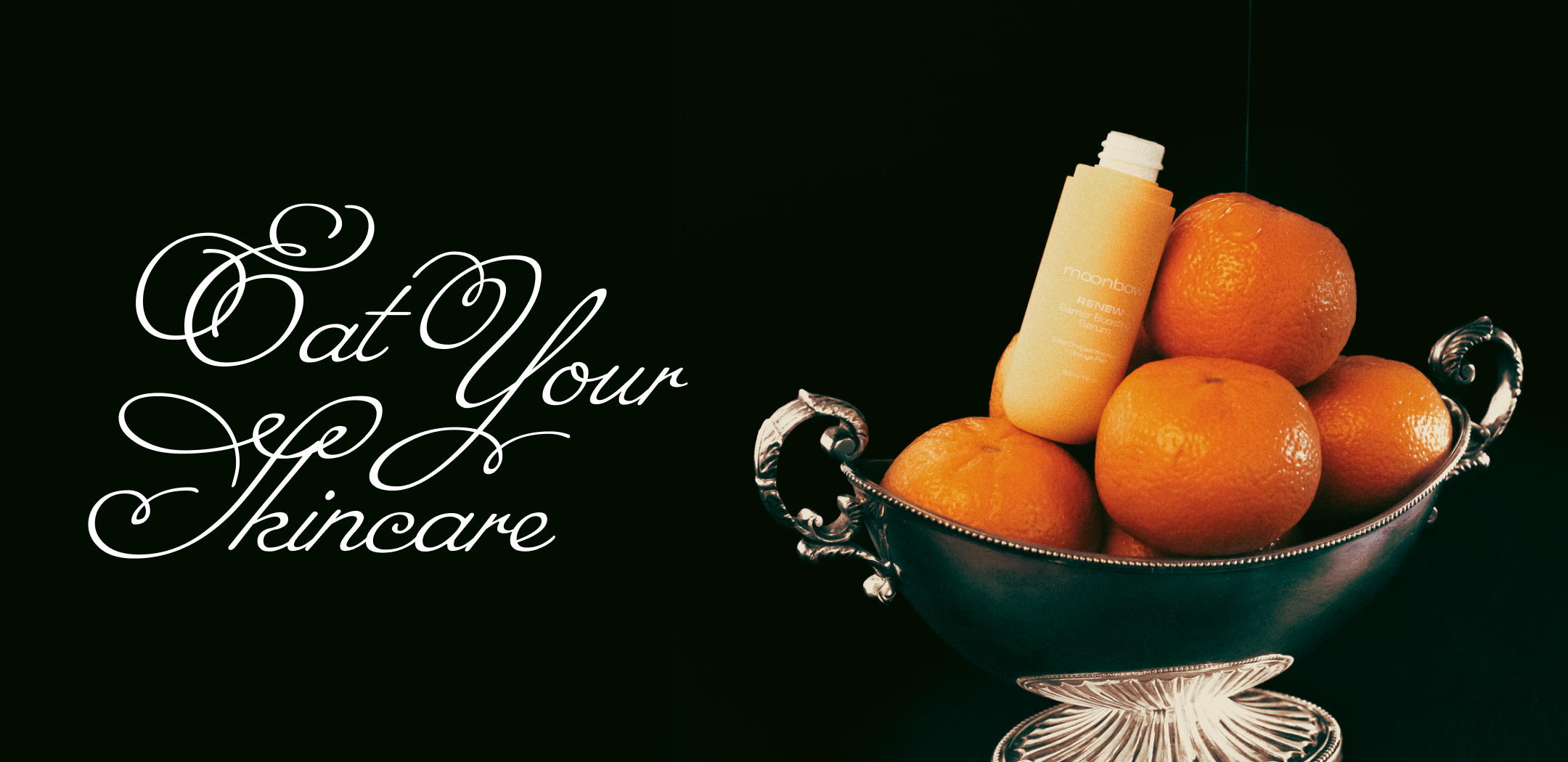
Eat Your Skincare
For Moonbow’s very first brand campaign, we launched Eat Your Skincare: food for your skin, inspired by our ancestors. Moonbow’s ethos is centered around the Traditional Chinese Medicine belief that what we eat internally reflects externally. And while eating these ancient Chinese herbs is the best skin remedy, Moonbow’s products contain over 15 TCM ingredients so you have the convenience of absorbing them topically. To make this come to life, we went with a moody ingredient-focused shoot.
I had the great privilege to creative direct, produce, edit, source, and style this entire shoot.
Photos by Zoey Marchinak
Creative Director: me
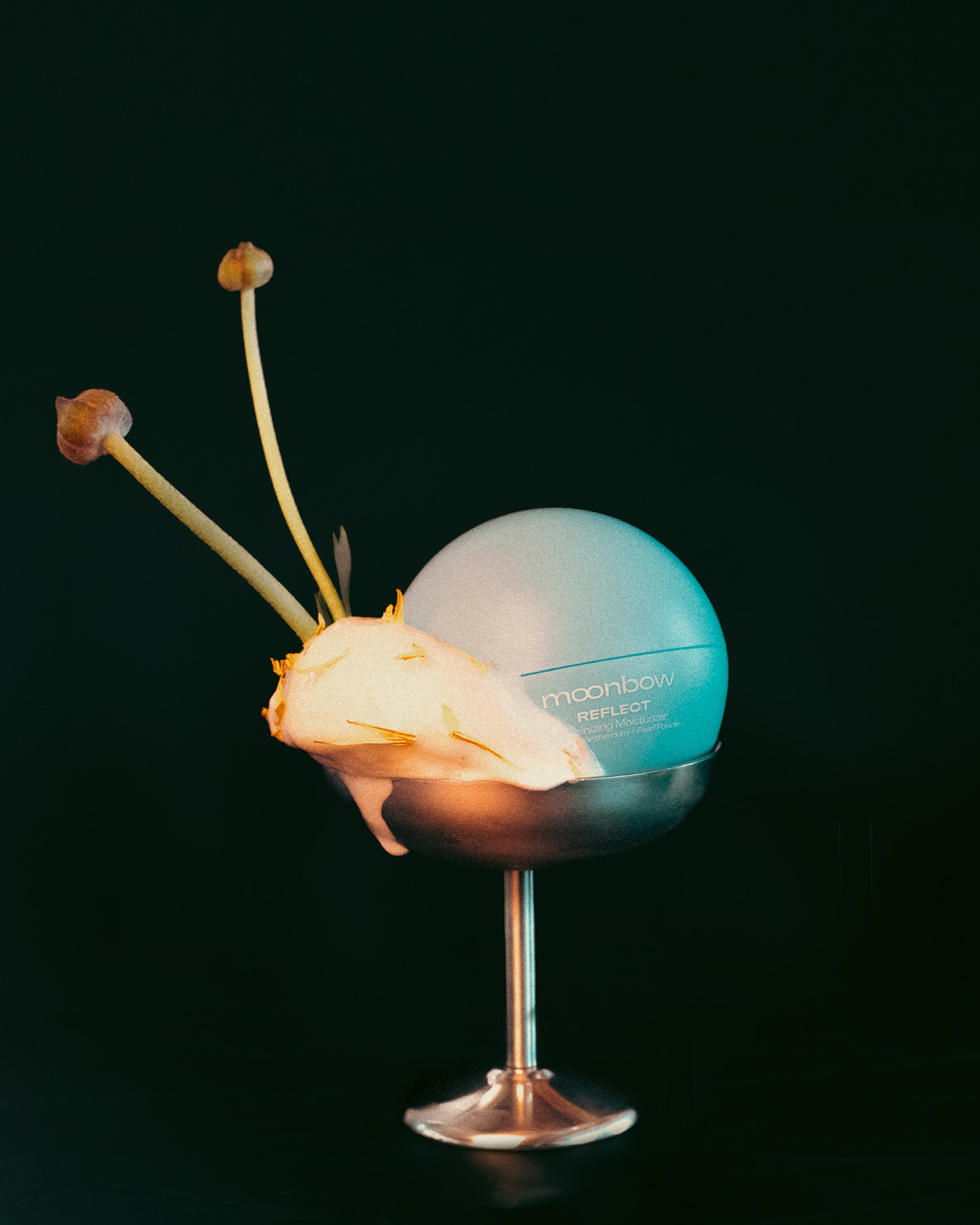
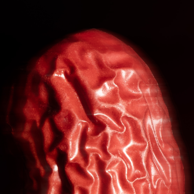
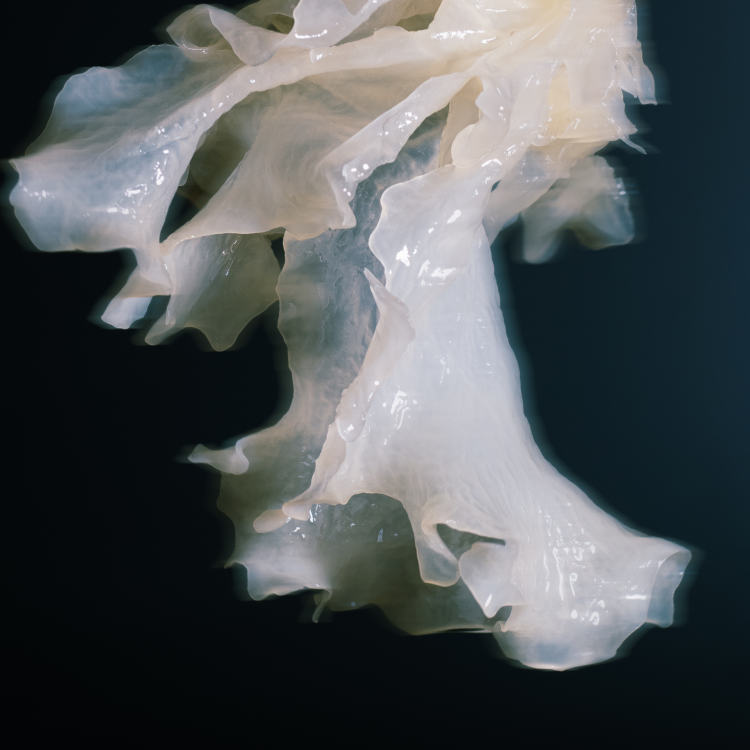
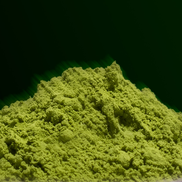
INGREDIENTS SHOOT
A collection of the beautiful Traditional Chinese Medicine herbs used in Moonbow’s products. We leaned into the ethereal & mysterious nature of these herbs, and absolutely love the way it turned out.
Photographer & Editor: Rachel MacNiell
Art Direction: me


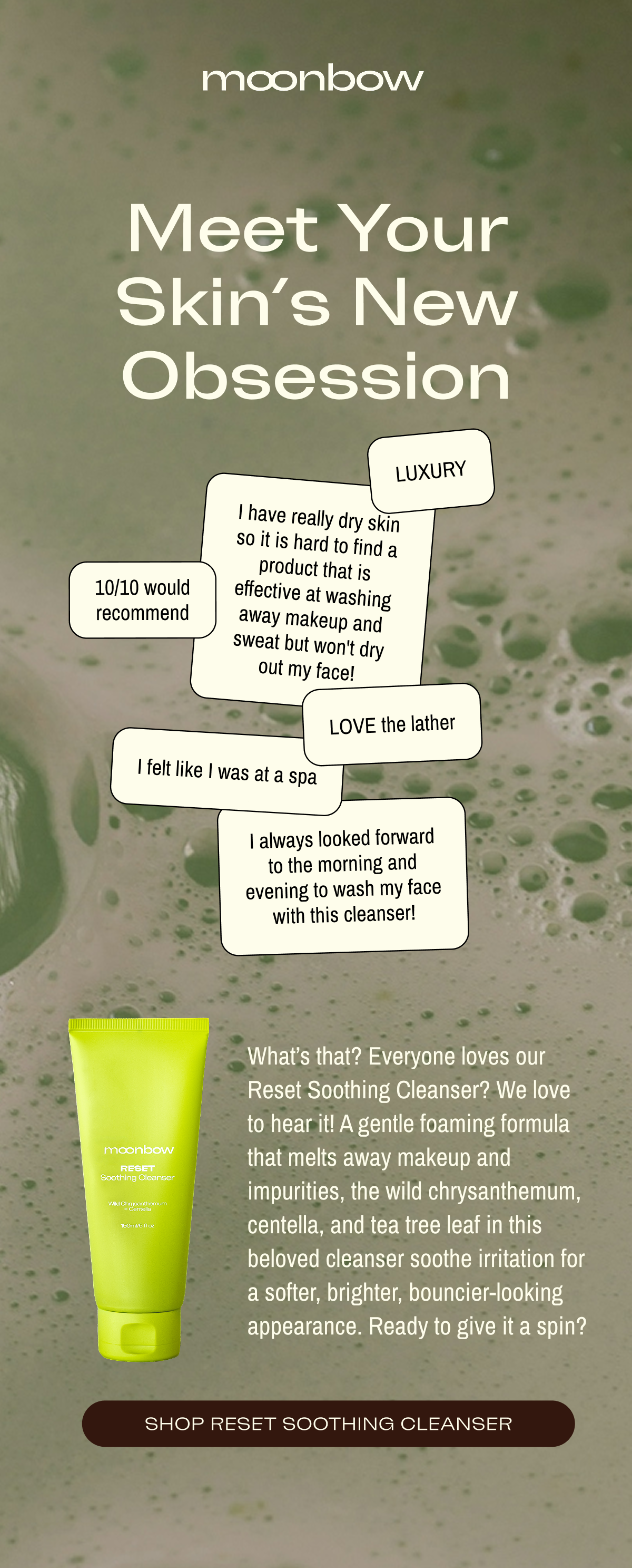
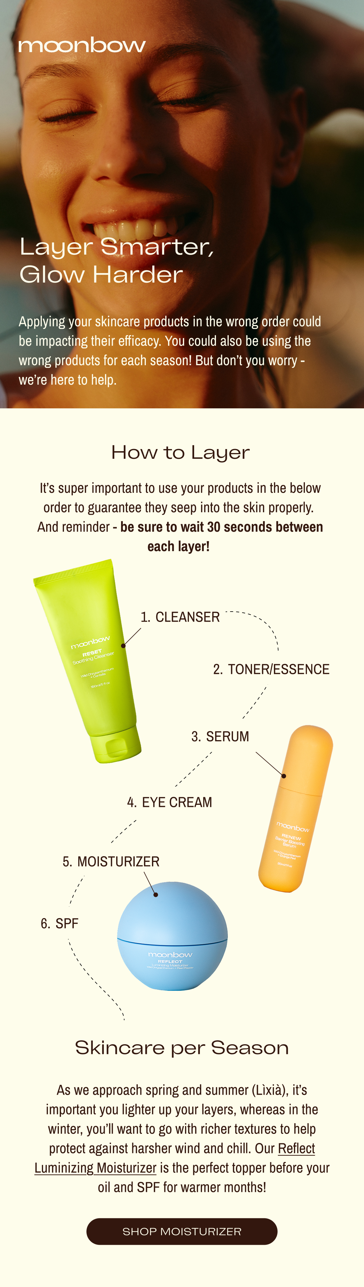
Email Design


3D RENDERINGS
As we waited for final packaging to arrive, I mocked up some 3D Renderings using Adobe Dimension to bring the products to life


